Design a Creepy Horror Film Poster
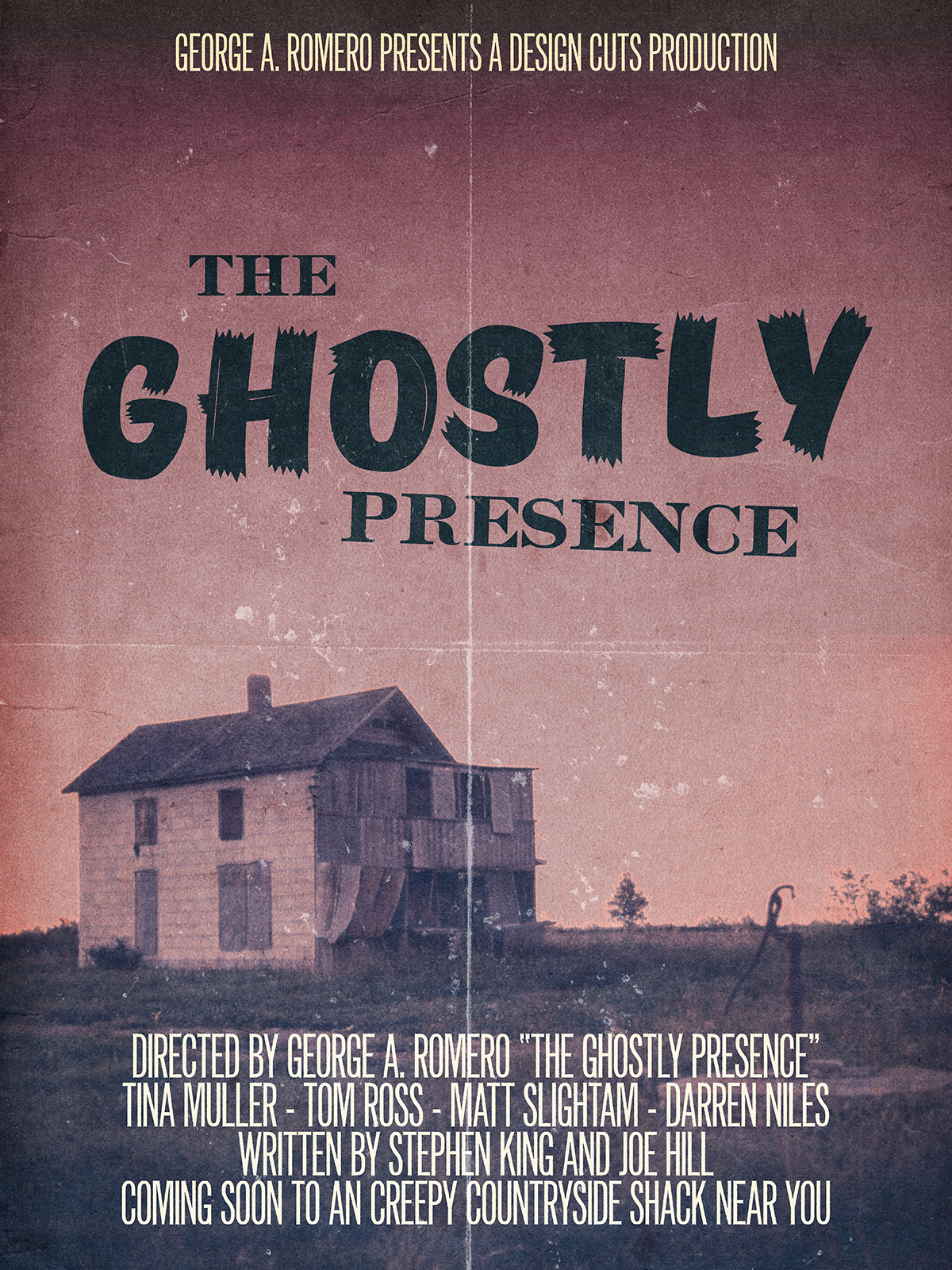
This week’s Design Cuts tutorial #2 was live from under the heat wave that was crushing France at the time. The mission this time is to create a poster for a (fake) ghost/horror movie, The Ghostly Presence. There are plenty of great typefaces within the 24 exceptional quality fonts bundle to play and experiment with. The idea behind the poster layout came from this great photo of an abandoned house in Kansas. The image is from the US National Archives, which means it’s copyright free. It dates back to the 1970s, and was part of a neat documentary project called DOCUMERICA. After chatting extensively with the Design Geeks, we decided the image would be perfect to illustrate the ultimate scary, creepy, countryside shack no one wants to go into. From there, a quick look at the typeface list, and the puzzle was solving itself. A typeface like TT Masters Birds is a solid take on the brush scripts found in old horror B-movie posters. Gearwright’s Caston typeface is a solid pendant to the spontaneous and dynamic nature of the brush lettering. Finally, Gearwright’s Newston will be a good fit for the credits area of the poster, with its tall and thin letters.
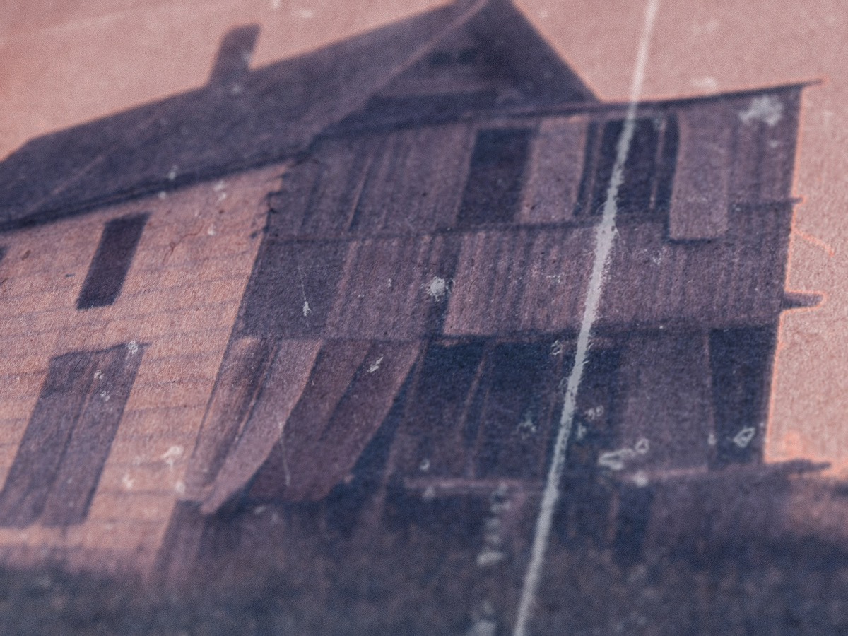
The idea behind the poster layout came from this great photo of an abandoned house in Kansas. The image is from the US National Archives, which means it’s copyright free. It dates back to the 1970s, and was part of a neat documentary project called DOCUMERICA.
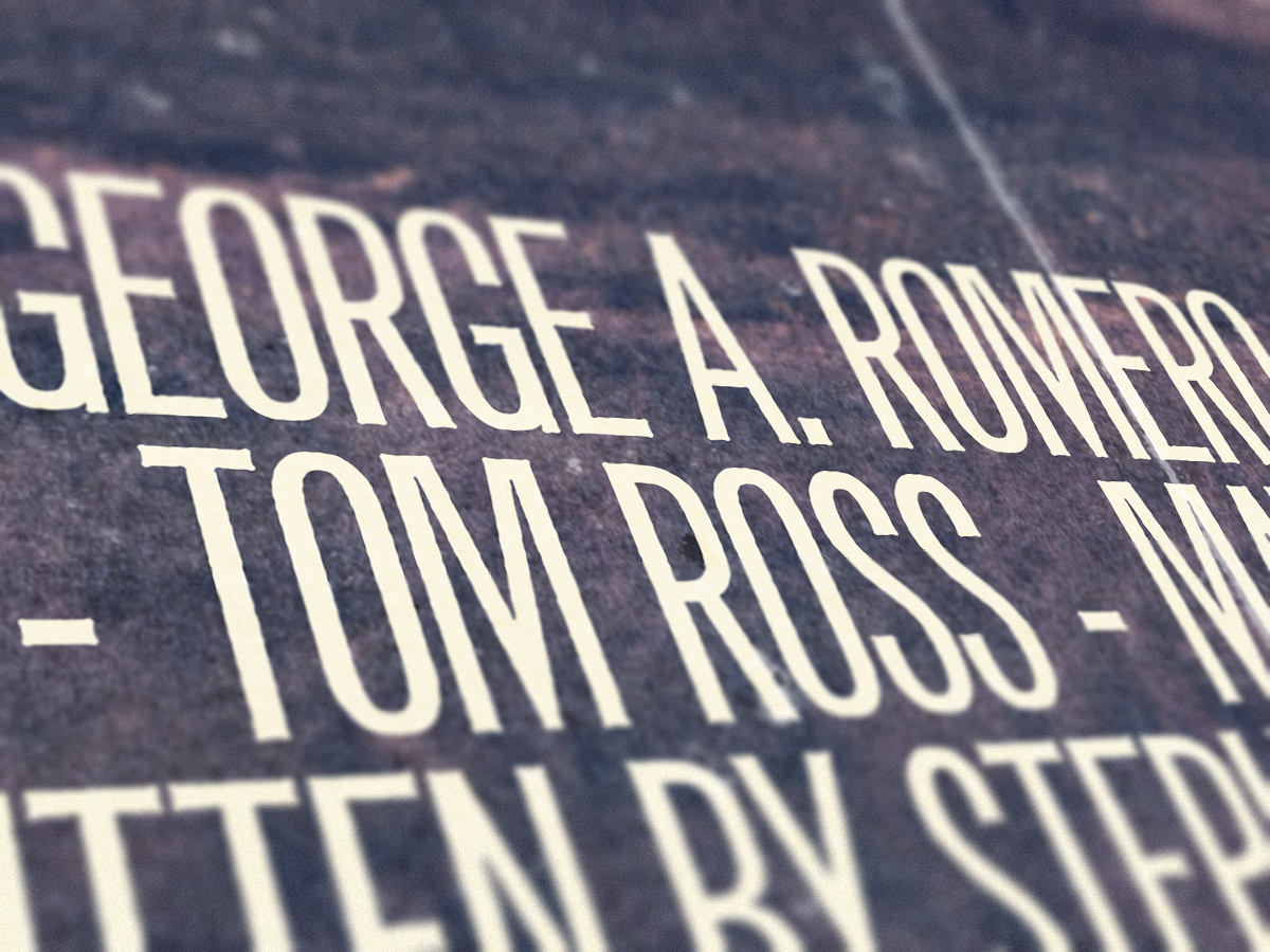
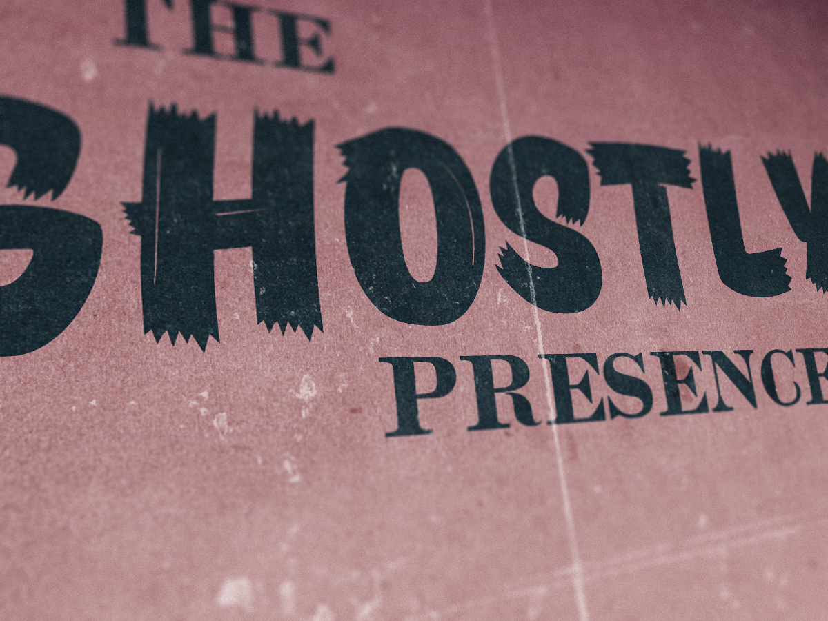
After chatting extensively with the Design Geeks, we decided the image would be perfect to illustrate the ultimate scary, creepy, countryside shack no one wants to go into. From there, a quick look at the typeface list, and the puzzle was solving itself. A typeface like TT Masters Birds is a solid take on the brush scripts found in old horror B-movie posters. Gearwright’s Caston typeface is a solid pendant to the spontaneous and dynamic nature of the brush lettering. Finally, Gearwright’s Newston will be a good fit for the credits area of the poster, with its tall and thin letters.